|
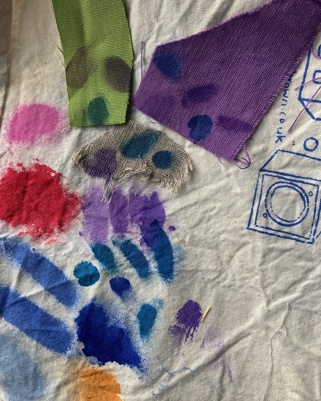
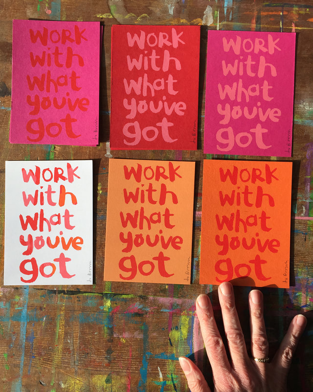
I am working on my next set of printed fabrics, and I am using some 'found' fabrics. In keeping with my Work With What You've Got ethos, I am using some fabrics that were the leftovers from someone else's projects- so not my choices really. Lots of neutrals, and purple! Not my usual choices of colours. It is stretching me a bit to make the colours work together.
I spent all of yesterday morning mixing colours, out of my comfort zone. Really, I find purple scary. Here are some examples of my experiments mixing dyes yesterday at the wonderful @eastsideprint_brighton smudged onto the backing cloth. I am using transparent mixes of inks, so the base colour really affects the result - the sludgy colours on the green swatch are the same colours as on the purple and cream swatches. (I could use opaque inks but I wanted the pattern to sink in rather than sit on top of the fabric) The bubblegum pink, red and bright blues are from my previous projects - the colours I usually go for Will let you see the results soon. .
0 Comments
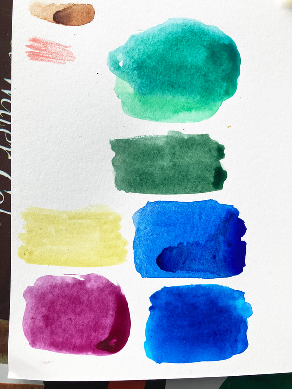
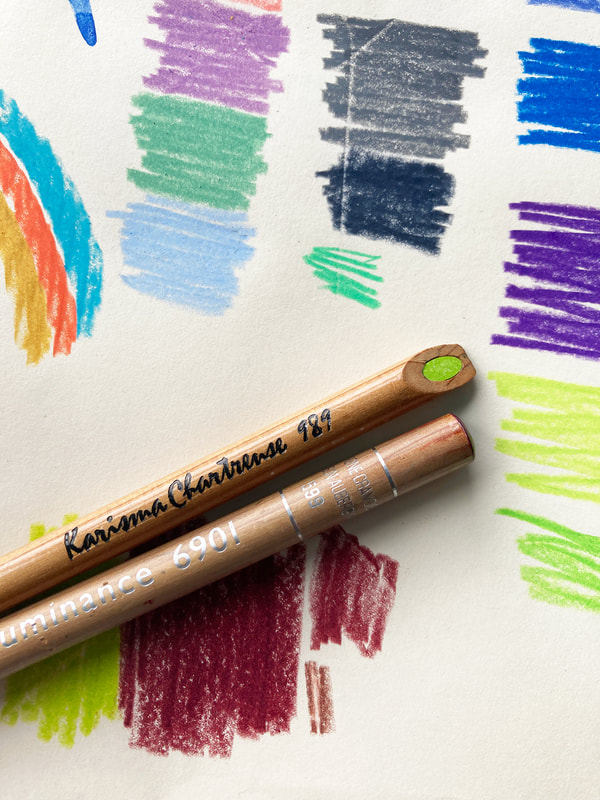
What's YOUR favourite colour? Now, what colour would you put with it? We all have our favourite colours, but what about colour combinations? The colour you put NEXT to a colour can have a big impact. They could be clashing colours that bounce off each other, very high contrast. Or they could be subtle colours that 'go' together. That sweet spot where everything is harmonious, nothing is jarring, or more prominent than anything else. It seems simple, just pick the colours you like? There are lots of things to consider, including how the colours are going to be used. What looks great on paper, or in theory, could be awful in real life, Can you live with those colours on the wall? Will they make you feel irritable after half an hour? Different colours can affect you psychologically, some lift you, some calm you. Would wearing those colours make you look washed out? And as a design or illustration for fabric or picture book - will those colours from your painted artwork reproduce as you intend them to be, or will they end up as something else in production? Sometimes you have to design with that in mind. My favourite but elusive colour combination. I am really fond of pink and red and orange together, but it can be problematic, because those colours are usually close in tone, with not a lot of contrast. (if the image was switched to black and white, they might be similar greys ) This is a problem when reproducing artwork to print it digitally (for publishing for example. Painted artwork can look very different when it is scanned/photographed.* All the subtle differences between the colours that you can see in real life can be lost when reproducing digitally. So I generally avoid this combination of pink/red/orange in work that is to be developed for printing digitally. But I still love it. In Screen Printing however, I have control over the ink I use, and can experiment with different background colours to print on. This is probably why my range of prints are multicoloured - I want to try all the different combinations. *Pale turquoise blue for instance hardly scans at all. In fact there is a special pencil of this colour that you can use for sketches, so that rough lines won't show in the final scanned piece. (In my illustration work I have developed a palette of gouache colours that I know will scan faithfully - hopefully the finished result will be what I intended, i just have to avoid the beautiful red/pink/orange ) Colour Inspiration
I like to collect colour combinations from real life. Unexpected combinations that I wouldn't necessarily think of. Rows of houses with random colours can produce really good combinations. I have a Pinterest board of colour combinations that I find inspiring, have a look at JoBrownPix Please join Ketchup! for news of the latest product drops in my shop, occasional discounts work in progress, and special exclusive offers.
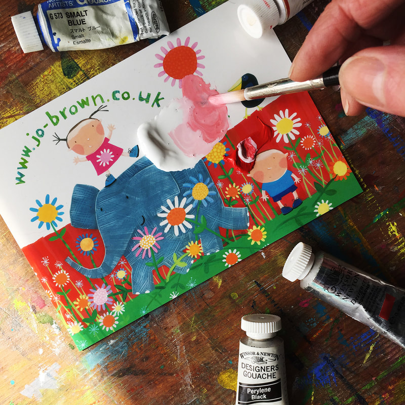
Gouache paint is a thick watercolour paint, that is opaque. It is great for flat areas of colour - by flat I mean even, no patchiness, completely covering the surface it is on.
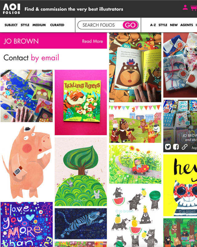
Here are some tips from my years of painting with gouache, that I hope you will find useful. 1.You don't need a fancy paint palette. Squeeze out a little blob of paint onto a shiny surface - a printed postcard, or a plate or a paint palette (plastic or ceramic) wet a brush, a size 6 round brush is good for this, and add a little water to the paint, mix with the brush until it is the consistency of single cream. I just updated my Association of Illustrators page this week. I wanted to tell you how much I appreciate them, and what good work they do for freelance illustrators like me.I've been a member for years. It is tough being a freelance illustrator, and it can be a very isolating experience, especially if you don't work in a shared studio where you would have other artists to talk to about problems.
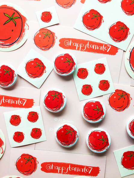
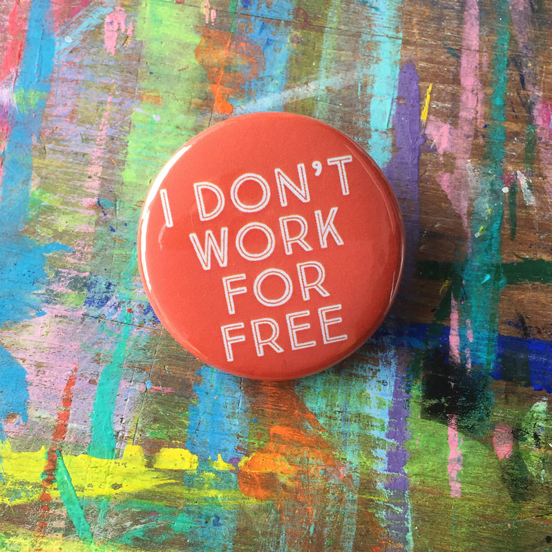
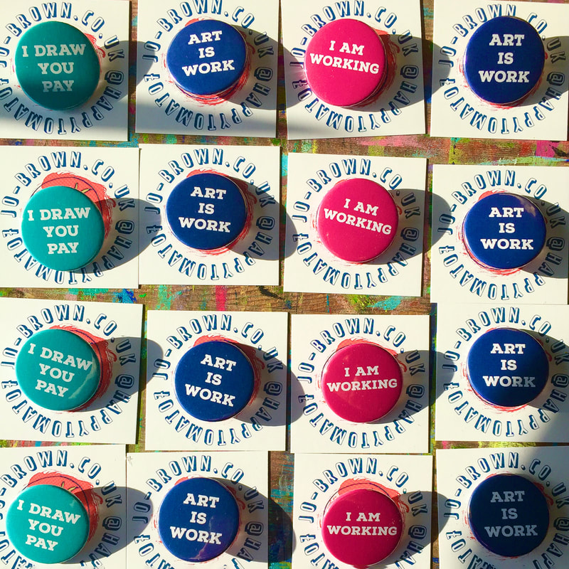
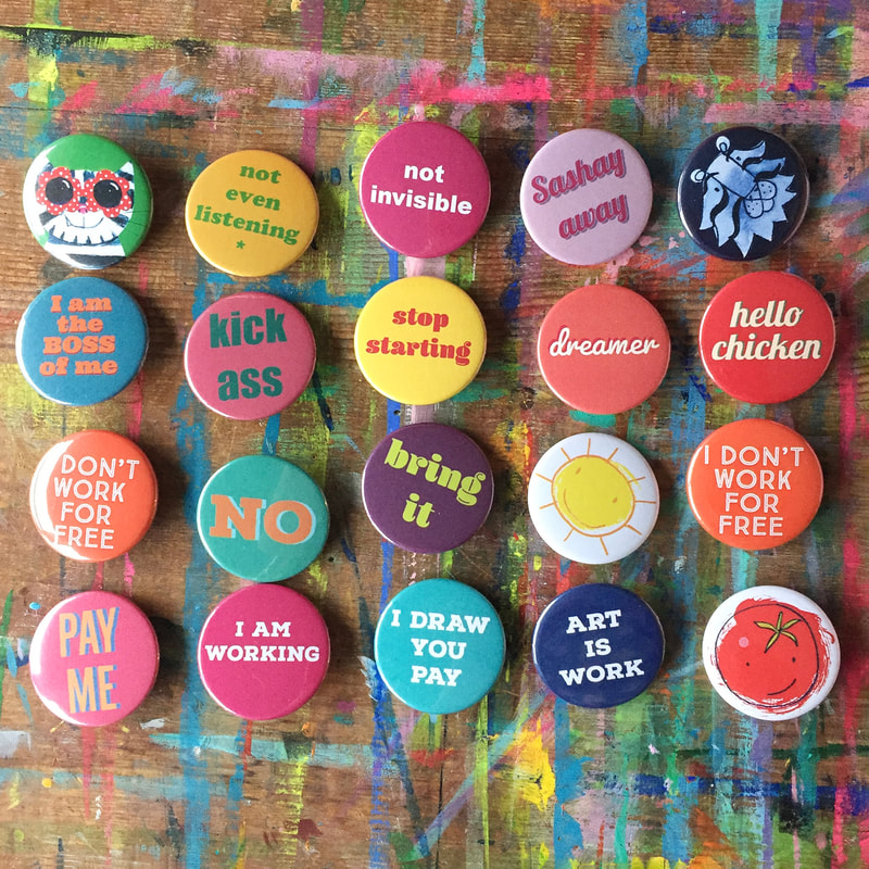
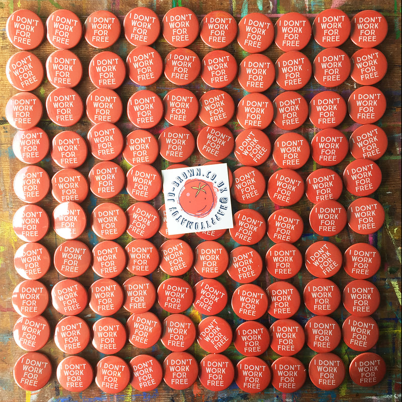
The AOI support, promote, and protect illustrators in many ways. . They provide help and advice with legal matters, contracts, licences, price negotiations etc. They run provide seminars and write articles on things that relate to illustrators. You can have a portfolio on their site, where commissioners can find you. They run portfolio consultations where you can get advice on the direction you should go in, what elements could be missing from your portfolio, etc. They do a fantastic job at campaigning for illustrators on topics such as copyright The AOI also advertise meet ups for illustrators which take place all over the country. Have a look at the Association of Illustrators here. There iBadges by Jo Brown, Illustrator, who DOESN'T Work for FREE. I created these pin badges initially for my own amusement, but they are proving very popular, particularly artists and makers of all kinds, and the self-employed. Somehow writing it on a badge reinforces the message, and if someone comments on it, it starts a conversation. Creatives are often asked to do something 'for free' by a relative, a friend or in business - though they don't frame it that way - more likely something like: 'It'll be great exposure! ' 'You will be seen by all our followers', 'it's a great opportunity', '-it's for a good cause... ' 'it'll only take you five minutes' (!) 'We have no budget...' 'but you do it because you love it...' Or, they can minimise the effort by beginning 'Just...' as if the thing asked for takes no effort at all. Why I Don't Work For Free (and neither should you) 1. Art is work. It takes time and skill, and effort. Years of training, development and practice. It could be a 'quick sketch' but years of drawing and choice making have got you to the point where you can do that sketch. 2. Just because you love something, it doesn't mean it doesn't have value. You wouldn't ask a plumber to work for free because they love plumbing, would you? (there is a third reason, see end of post) So with all these things in mind, I created my badge I Don't Work For Free. I had photos of it in my images that I used to apply to markets last year, and it led to a really fun collaboration. The Illustrators' Fair organisers commissioned me to provide badges for stallholders in Summer 2023. It was great seeing everyone wearing them, and sharing the message on social media. In December the range of self employed artist badges expanded to Art Is Work, I Am Working and my favourite I Draw, You Pay. I have other ranges of badges, not just for the self employed, but lots of them have messages. The messages are different depending on the viewer, I think, you can put your own spin on it.
I am particularly fond of Not Even Listening. Buy my badges here. 3.If you needed it, yet another reason you shouldn't work for free. Nobody values something they didn't have to pay for. If you work for free, the person will not value your work. They won't want to pay for it next time either. I love painting on different paper surfaces, it gives a different look and texture to the painted areas, and you can leave some areas unpainted. This article describes working on hand made textured paper.
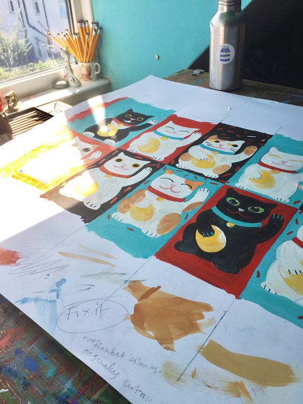
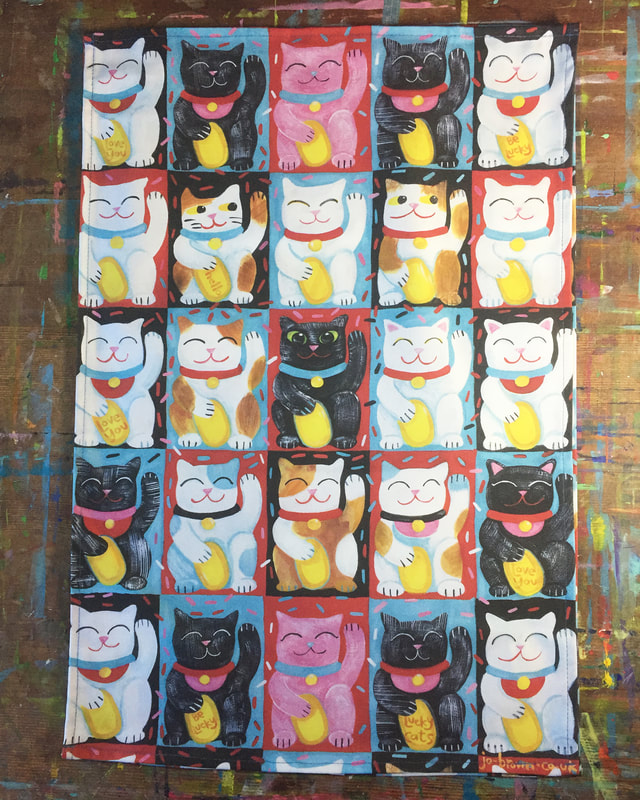
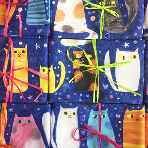
I recently launched my latest tea towel design, Lucky Cats. I thought I would share some of the original artwork and preparation that went into this design.
This is a design that I'd had on hold for a LOOOOOOOONNNNNNG time. I had originally intended to print it for myself via Spoonflower, and make a curtain out of it. Inspiration: Lucky Cats. We have quite a few of them. Also real cats. We have two of those, and they are tuxedo cats (black -and white bibs and cuffs) Colour scheme. I have a fabulous vintage blanket that I got at a carboot. It is black and red and turquoise, and I use it to cover our sofa. I have sort of styled our living room round those colours, so that's why I decided on the main colours of this design. My second range of tea towels are now in my shop. Some of the first range are now out of stock, but the designs may reappear later (LoveCats, I'm looking at you...)
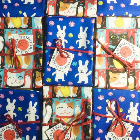
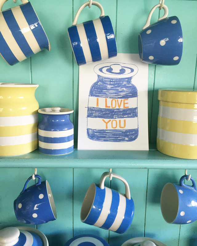
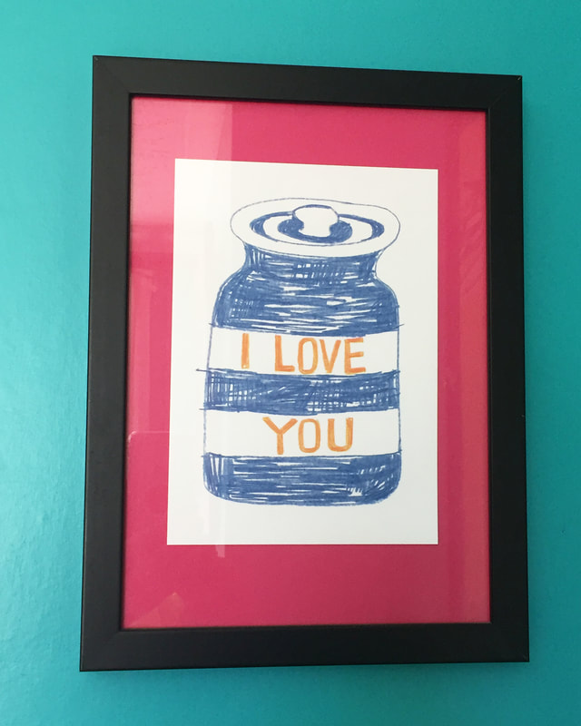
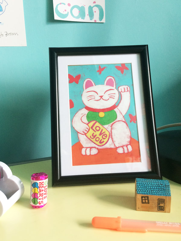
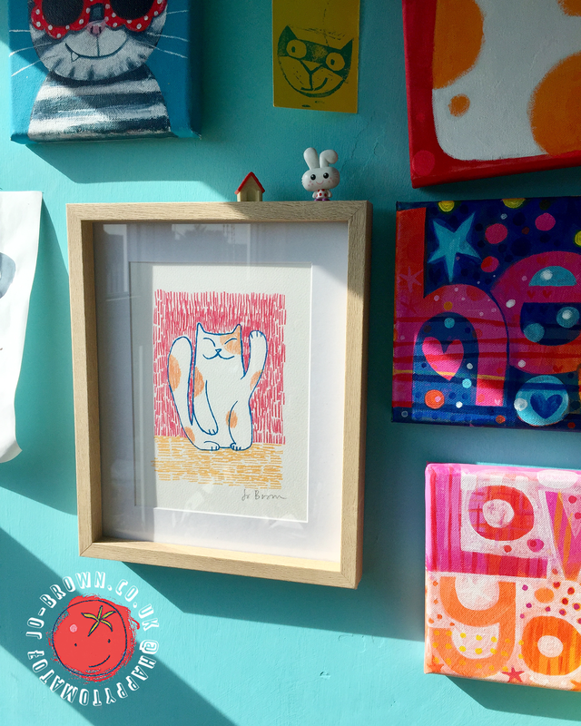
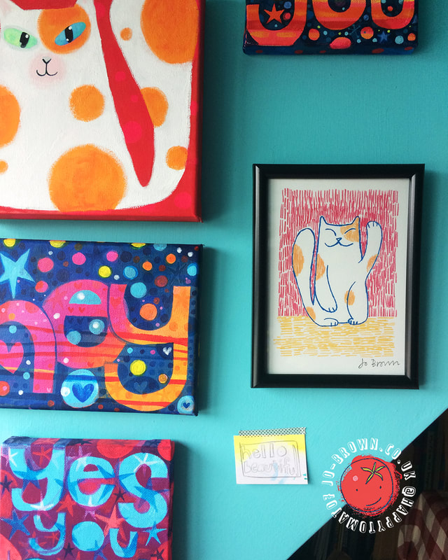
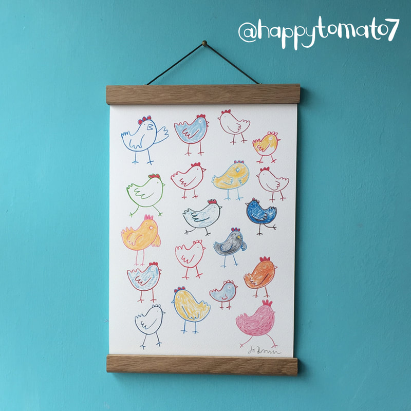
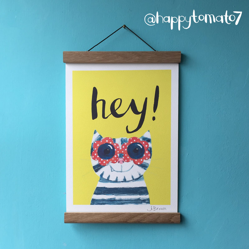
The latest range includes the brand new Lucky Cats, and Happy Bunnies. Perfect for adding fun and colour to your kitchen, or for a housewarming gift. All printed in the UK on 309gsm half Panama cotton, really thick and sturdy, with great print quality, the colours are great! These are my first homewares prints, although I have produced a lot of fashion prints in the past. There are lots of wonderful inexpensive prints available to decorate your home and work space (mine included!) However, framing is very EXPENSIVE! If you have gone to the trouble of finding something fun bright, and contemporary you don't want to ruin the look/break your budget with costly framing, starchy mouldings and bland mounts do you?
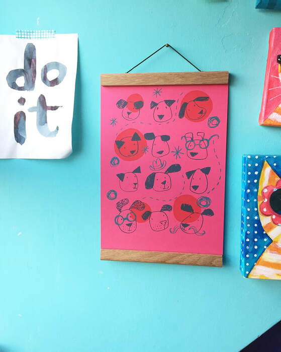
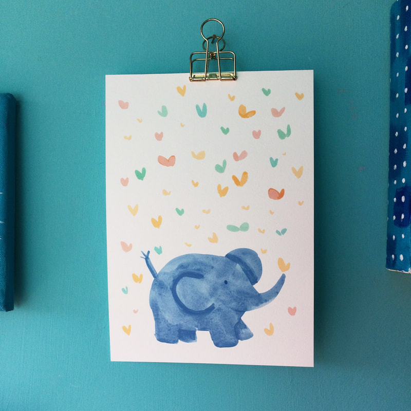
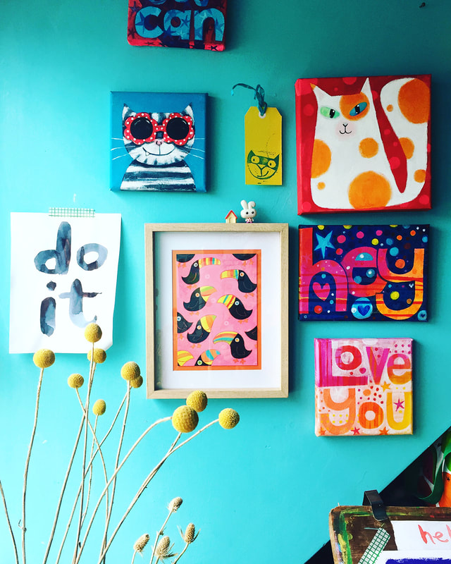
There are lots of options to display your prints in fun ways without spending a lot of cash. |
AuthorJo Brown, Illustrator. Archives
February 2024
Categories
All
Want to see which books I recommend?
My affiliate bookshop on bookshop.org is here I buy most of my art materials at jacksonsart .com - affiliate link here, you get 10% off first order.
|
 RSS Feed

