Jo Brown's news and thoughts. |
Jo Brown's news and thoughts. |
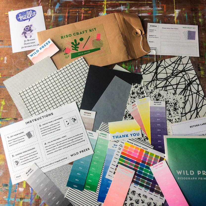 I've wanted to try Riso printing for ages - and I put it on my list of things I wanted to achieve in 2021. I've seen lots of examples and read up on the theory, techniques etc, and looked at various riso printing companies, but just hadn't got around to doing it - until I saw this kit by @Wild__Press (part of women-run creative studio Wild and Kind based in Glasgow) -which was perfect for me. The kit contains all the ingredients for riso printing, clear explanations of the printing process, colour charts showing how the colours look when overlapping, and sheets of pre-prepared textures and patterns to use as collage. There is a choice of kits, A4 print or A5 postcard, I chose the A4 print option. A quick explanation of riso printing - it is an eco-friendly, inexpensive form of printing originating from the 1980s which combines qualities of photocopying and screen printing - the prints are made in single colour layers, and the look of the prints are typified by irregularities such as misalignment, variation in textures, overlapping colours, - basically you get a homespun aesthetic - they don't look perfect, each print can be slightly different -all these things really appeal to me! The riso printer (which looks like a big photocopier) scans the artwork (or you can input a digital file) and burns a stencil on thermal paper made from banana fibres. This is wrapped around an ink drum, which rotates, and paper is pulled through the machine across the ink drum, and ink is pushed through the stencil onto the paper. This is repeated for the next colour - registration is not always exact, which is one of the beauties of riso printing, each print is a little bit different from the last, and this is what makes it popular with artists. I can obsess over details sometimes - previously when I thought about doing riso prints I had tried making digital versions of riso prints, making several transparent layers in Photoshop, and I also tried separating an existing full colour artwork into separate black and white layers (there's a great tutorial on that from Shutterstock here) ; - but for me it was all a bit too involved and fussy - I wasn't getting anywhere and I lost heart and gave up. This time I wanted something more hands on, and immediate -I just opened up the pack and the fact that it was all laid out there, made it so easy to just jump in. In the pack there were two A6 pieces of paper, (one was tracing paper) and various sheets of black and white textures - you make two drawings or collages, one for each colour that you are going to use. I used the mechanical dot patterned paper-like a Lichtenstein print texture- which I cut into shapes, and I drew chicken characters with a black Luminance pencil - I really like the texture of these, (almost as good as Karisma but I can't find those any more) -- I divided my design between the two pages as one sheet was see through I could see what was going to overlap, and I decided I would have one printed blue and one printed fluorescent pink. As you are only working in black, you have to remember that the stronger the black, the stronger the colour that will be printed - so pale black = pale blue, strong black =strong blue - in the pack were colour swatches demonstrating the depths of colour you get at different percentages, and also a chart to show you what happens when those colours overlap with a different colour. The best bit for me was: I just got on with it without overthinking- I drew quickly, pasted on some bit of textured dots, put it back in the envelope, added the prepaid label and put it in the postbox - and got the results back in a few days. 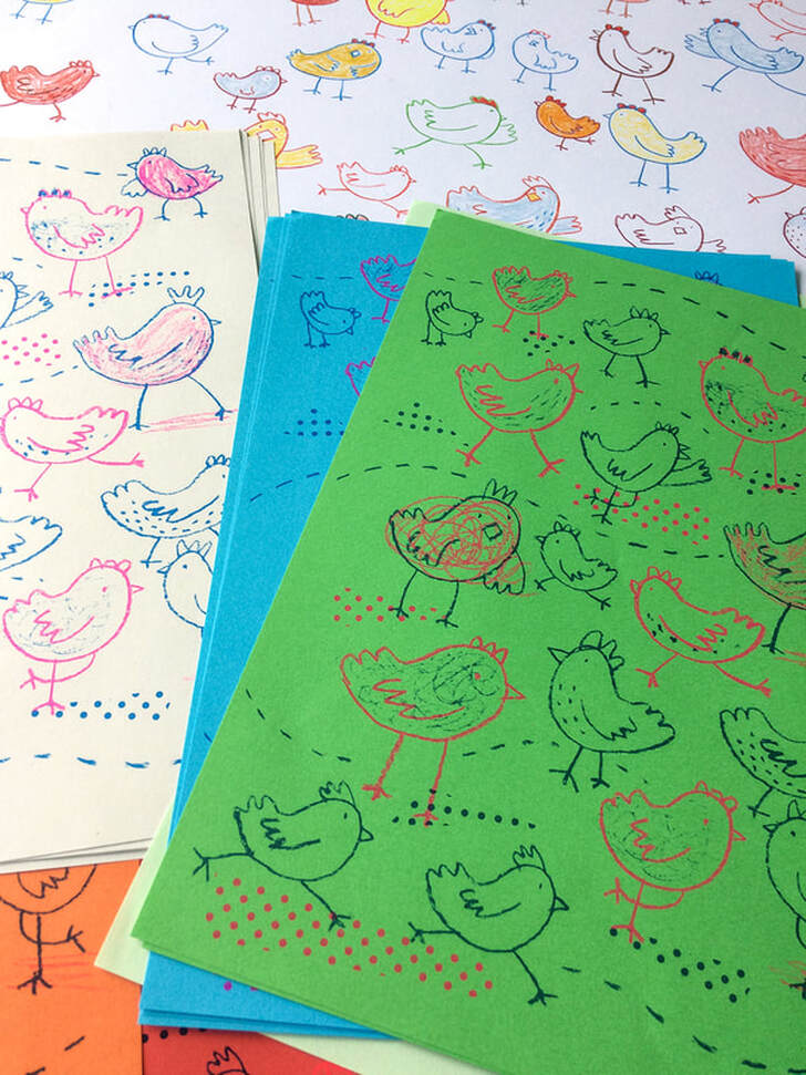 I like it when I'm making some artwork and things are taken out of my hands, when I don't have total control over the outcome, and there are unexpected results. What I liked about this project is that the finished prints (20 x A4 scaled up from the original A6 design) were a bit of a surprise to me -I had an idea what they would look like, but not exactly.They were printed in fluorescent pink*, and blue which I had chosen from the swatches- I also selected multi coloured paper so I could see what the inks would look like on different coloured background, as research for future projects. I was trying to do what i would do if I were in the print studio myself, try lots of options until I saw what worked. I was really happy with the way the prints turned out, they have given me lots of inspiration for my next project and I feel more confident about the process. My thoughts are that next time, I will order my prints from Wild and Kind's mainline options- they print postcards, greetings cards, art prints up to A3- and I will try larger areas of colour, choose a heavy weight of paper and perhaps three print colours - for more surprises! *(fluorescent colours are very popular in riso prints, and another reason I wanted to try it - you can't get fluorescent colours with digital printing, which is a mix of magenta, cyan, yellow and black inks.) Check out Wild and Kind a women run creative studio they are amazing! Categories
0 Comments
I thought it was time I started to blog again, after a break of a couple of years or more- I was disillusioned with my old blog (on Blogger).
I have recently engaged more with Instagram and Facebook but I find the transience of it annoying - a lot of effort goes into posts that disappear from view so quickly (yeah, I know -algorithms*) and sometimes I just want to ramble on a bit... I may repost some bits from the old blog but mostly will be starting afresh. *- had to pause to look up the spelling of that, not what I expected- have a look at the etymology of it though, interesting....well now you can see what I'm like, I find that kind of thing fascinating. and it's not a rhythm. Which is a much more satisfying spelling, to me. |
AuthorJo Brown, Illustrator. Archives
July 2024
Categories
All
Want to see which books I recommend?
My affiliate bookshop on bookshop.org is here |
 RSS Feed
