Jo Brown's news and thoughts. |
Jo Brown's news and thoughts. |
|
What's YOUR favourite colour? Now, what colour would you put with it? We all have our favourite colours, but what about colour combinations? The colour you put NEXT to a colour can have a big impact. They could be clashing colours that bounce off each other, very high contrast. Or they could be subtle colours that 'go' together. That sweet spot where everything is harmonious, nothing is jarring, or more prominent than anything else. It seems simple, just pick the colours you like? There are lots of things to consider, including how the colours are going to be used. What looks great on paper, or in theory, could be awful in real life, Can you live with those colours on the wall? Will they make you feel irritable after half an hour? Different colours can affect you psychologically, some lift you, some calm you. Would wearing those colours make you look washed out? And as a design or illustration for fabric or picture book - will those colours from your painted artwork reproduce as you intend them to be, or will they end up as something else in production? Sometimes you have to design with that in mind. 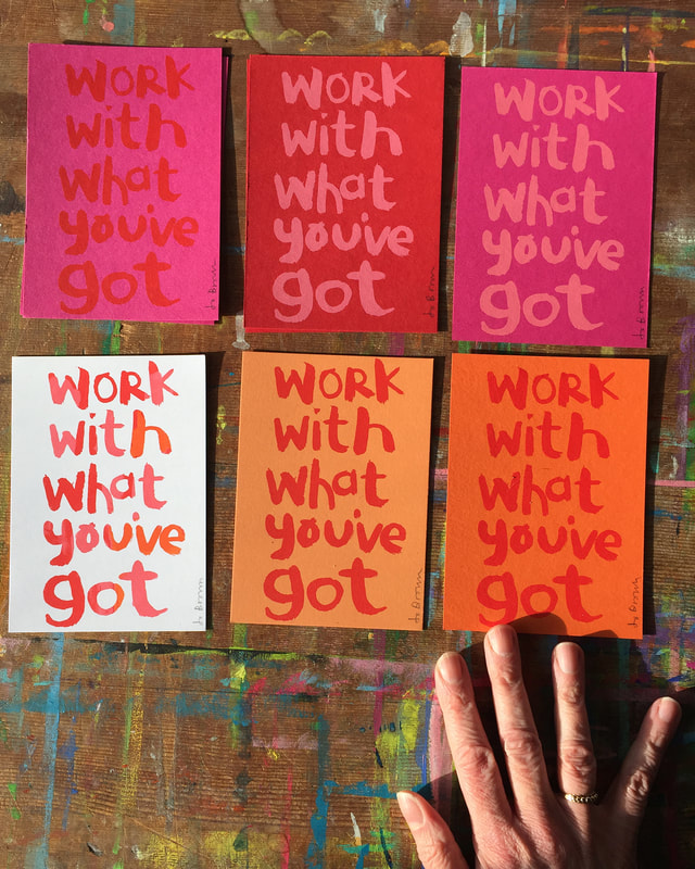 the same print in red, and pink, on different coloured backgrounds, My favourite but elusive colour combination. I am really fond of pink and red and orange together, but it can be problematic, because those colours are usually close in tone, with not a lot of contrast. (if the image was switched to black and white, they might be similar greys ) This is a problem when reproducing artwork to print it digitally (for publishing for example. Painted artwork can look very different when it is scanned/photographed.* All the subtle differences between the colours that you can see in real life can be lost when reproducing digitally. So I generally avoid this combination of pink/red/orange in work that is to be developed for printing digitally. But I still love it. In Screen Printing however, I have control over the ink I use, and can experiment with different background colours to print on. This is probably why my range of prints are multicoloured - I want to try all the different combinations. *Pale turquoise blue for instance hardly scans at all. In fact there is a special pencil of this colour that you can use for sketches, so that rough lines won't show in the final scanned piece. (In my illustration work I have developed a palette of gouache colours that I know will scan faithfully - hopefully the finished result will be what I intended, i just have to avoid the beautiful red/pink/orange ) 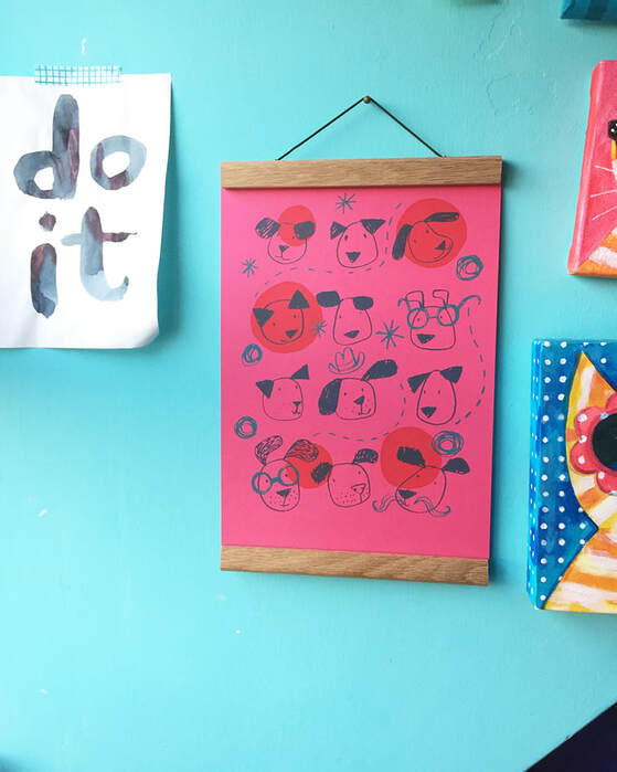 Happy Dogs Print - in pink and red! by Jo Brown Colour Inspiration
I like to collect colour combinations from real life. Unexpected combinations that I wouldn't necessarily think of. Rows of houses with random colours can produce really good combinations. I have a Pinterest board of colour combinations that I find inspiring, have a look at JoBrownPix 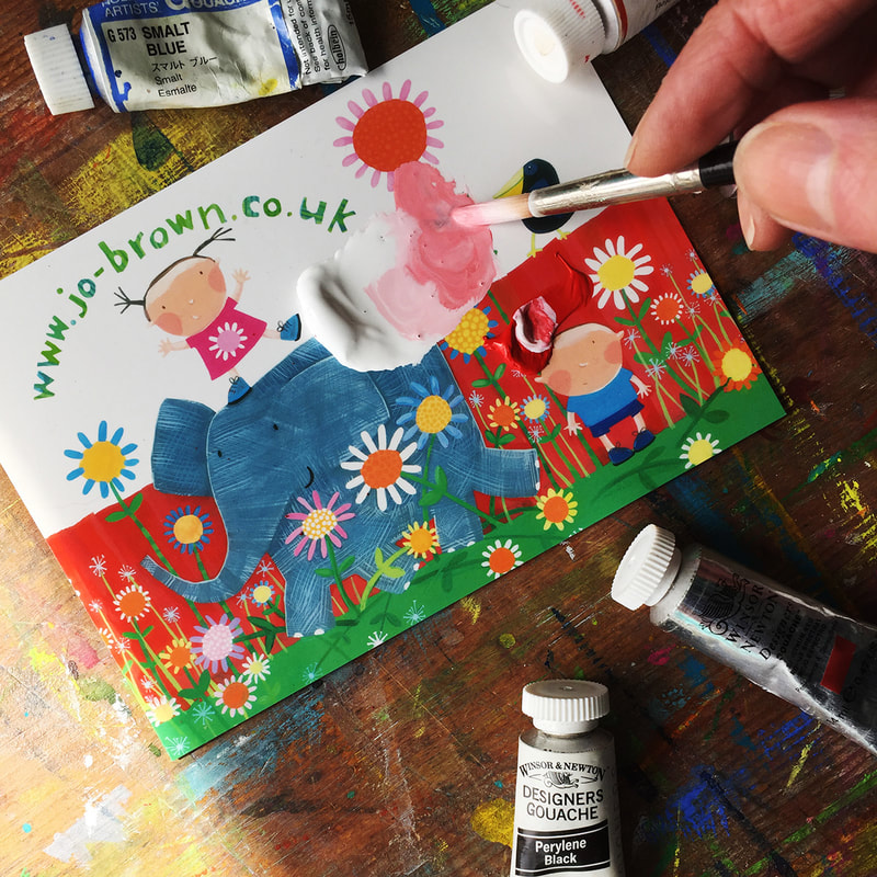 Using a shiny postcard as a paint palette for gouache. Gouache paint is a thick watercolour paint, that is opaque. It is great for flat areas of colour - by flat I mean even, no patchiness, completely covering the surface it is on.
Here are some tips from my years of painting with gouache, that I hope you will find useful. 1.You don't need a fancy paint palette. Squeeze out a little blob of paint onto a shiny surface - a printed postcard, or a plate or a paint palette (plastic or ceramic) wet a brush, a size 6 round brush is good for this, and add a little water to the paint, mix with the brush until it is the consistency of single cream. I love painting on different paper surfaces, it gives a different look and texture to the painted areas, and you can leave some areas unpainted. This article describes working on hand made textured paper.
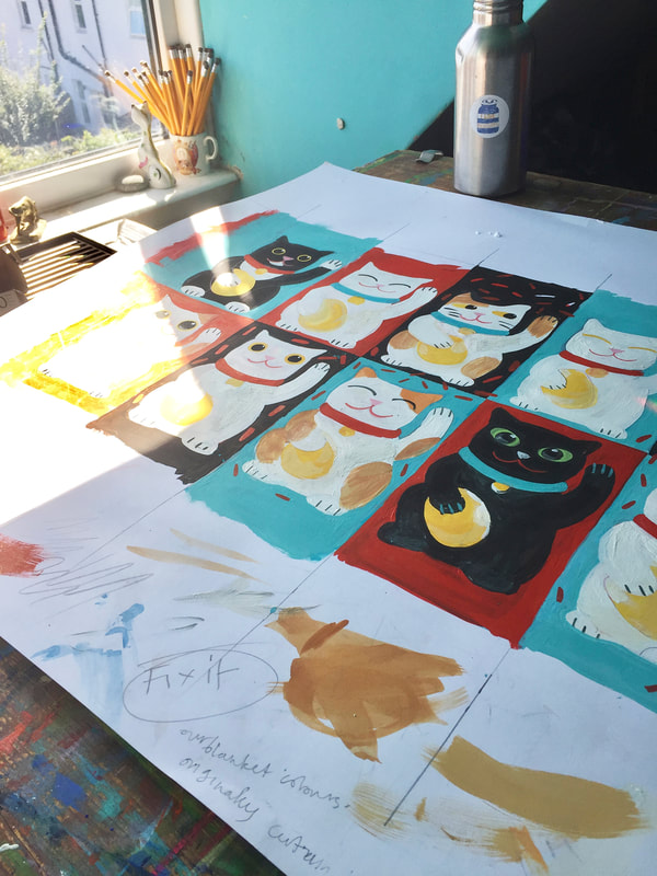
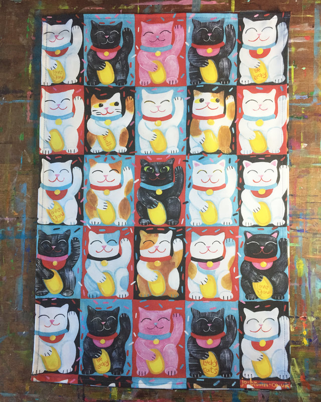
I recently launched my latest tea towel design, Lucky Cats. I thought I would share some of the original artwork and preparation that went into this design.
This is a design that I'd had on hold for a LOOOOOOOONNNNNNG time. I had originally intended to print it for myself via Spoonflower, and make a curtain out of it. Inspiration: Lucky Cats. We have quite a few of them. Also real cats. We have two of those, and they are tuxedo cats (black -and white bibs and cuffs) Colour scheme. I have a fabulous vintage blanket that I got at a carboot. It is black and red and turquoise, and I use it to cover our sofa. I have sort of styled our living room round those colours, so that's why I decided on the main colours of this design. Painting with Gouache- my method.
Gouache is a thick opaque watercolour paint used by artists and designers. (there is also acrylic gouache, but I will talk about that in a different post, it is great, but it acts differently and you don't want to mix them together) Gouache dries to a flat opaque matte finish (if you want it to) and you can overpaint it. If you are careful the new colour won't lift off/mix with the underneath one- great for someone like me who makes mistakes/ changes their mind… You can paint light colours over dark colours too, which is very useful. Gouache comes in tubes, or sometimes jars, and you just squeeze a small amount out on to a palette or plate, or my favourite, a shiny postcard- I'll tell you why later. |
AuthorJo Brown, Illustrator. Archives
July 2024
Categories
All
Want to see which books I recommend?
My affiliate bookshop on bookshop.org is here |

 RSS Feed