Jo Brown's news and thoughts. |
Jo Brown's news and thoughts. |
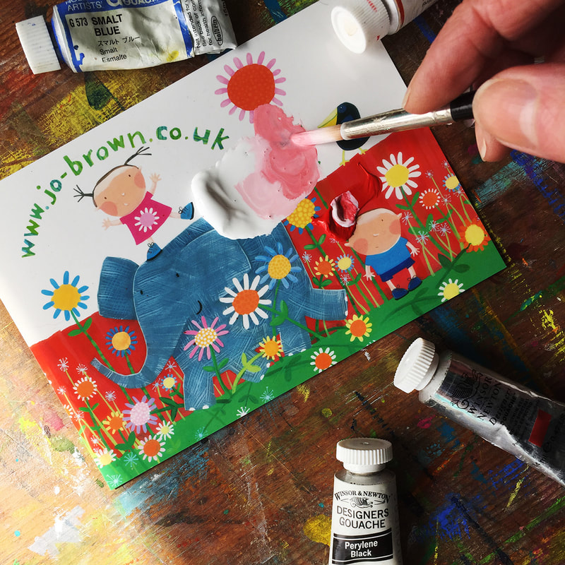 Using a shiny postcard as a paint palette for gouache. Gouache paint is a thick watercolour paint, that is opaque. It is great for flat areas of colour - by flat I mean even, no patchiness, completely covering the surface it is on.
Here are some tips from my years of painting with gouache, that I hope you will find useful. 1.You don't need a fancy paint palette. Squeeze out a little blob of paint onto a shiny surface - a printed postcard, or a plate or a paint palette (plastic or ceramic) wet a brush, a size 6 round brush is good for this, and add a little water to the paint, mix with the brush until it is the consistency of single cream. I love painting on different paper surfaces, it gives a different look and texture to the painted areas, and you can leave some areas unpainted. This article describes working on hand made textured paper.
Novelty Books - Flap books.
Readers Digest Zoo! book with fold out pages. There are lots of different types of children's books, and they require different things. Novelty books have some sort of interactive element - flaps, textures, moving parts such as pop ups or sliders, or fold out pages, to give a surprise element. I have worked lots of books with fold out pages, including this one Zoo! produced for Readers Digest Childrens Books. |
AuthorJo Brown, Illustrator. Archives
July 2024
Categories
All
Want to see which books I recommend?
My affiliate bookshop on bookshop.org is here |
 RSS Feed
