|
This is my hand painted sign for markets, I'm very fond of it, but sometimes I have too much to carry and it gets left at home.
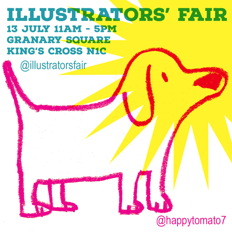
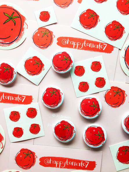
The happy tomato is the symbol of my shop and the name of my newsletter - Tomato Ketchup. I send out a fortnightly email to my subscribers with new products, special offers and links to the latest drops of limited edition products. If you would like to be included, you can join here. I will be at the Illustrators' Fair at Granary Square, King's Cross London N1C on Saturday 13th July 2024 11am to 5pm. I will have a selection of my latest screen printed items -including new t-shirts especially printed for this event, alongside my core range of cards prints and tea towels.
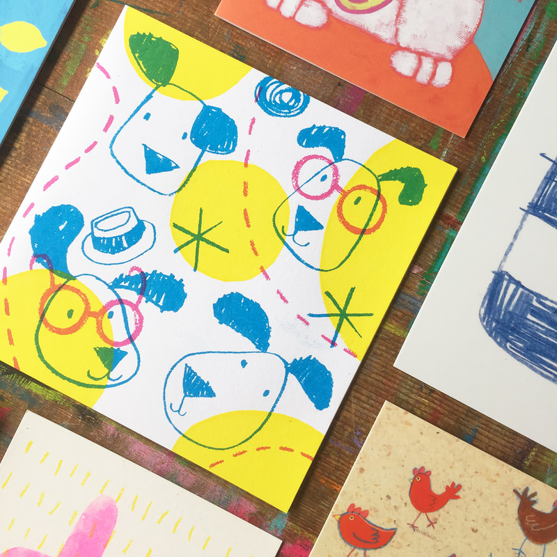
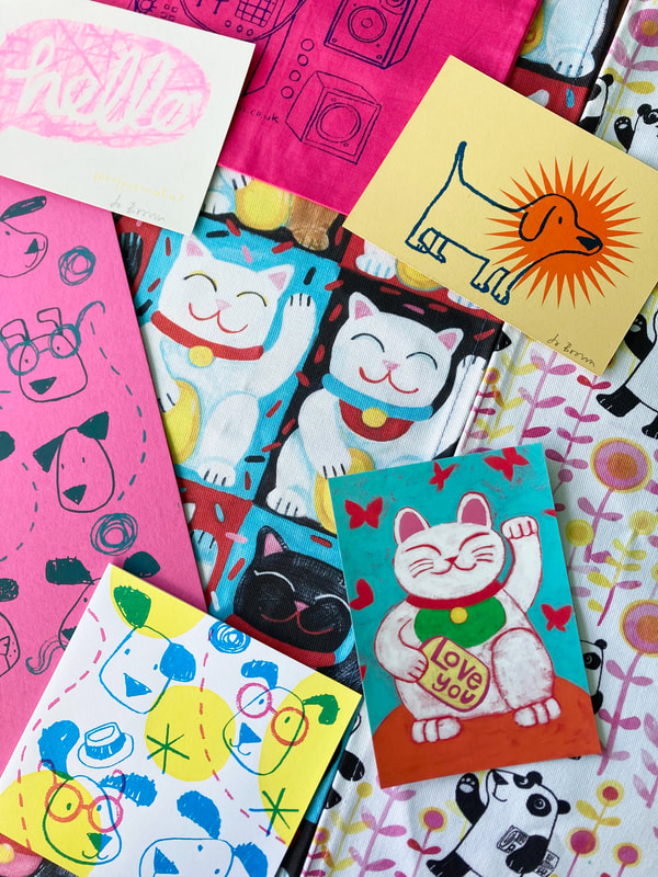
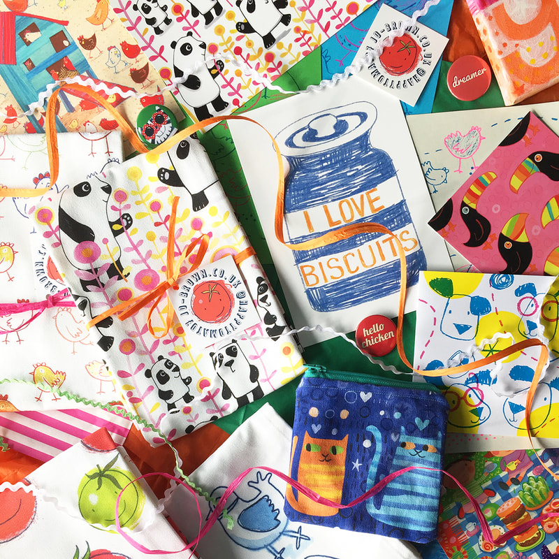
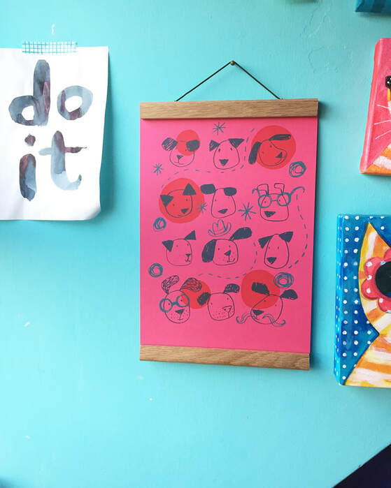
I have designed and printed a new range of cards featuring dogs...and tomatoes. Very short print runs, subject to change/whim! The beauty of printing my own cards is that I can change the colours/card stock as I go, trying out different combinations, see how I like it. So these cards might not be around very long in this form- if you like 'em get 'em while you can. Square cards and rectangular cards, available here. I have two types of prints in my shop Happy Tomato (and on my stall) digital and screen printed, and they have different qualities, and a totally different look. I like both for different reasons. I'll tell you why...
I am a freelance illustrator, but I also produce my own range of paper goods and textiles, which I sell under the banner of Happy Tomato, online and in person.
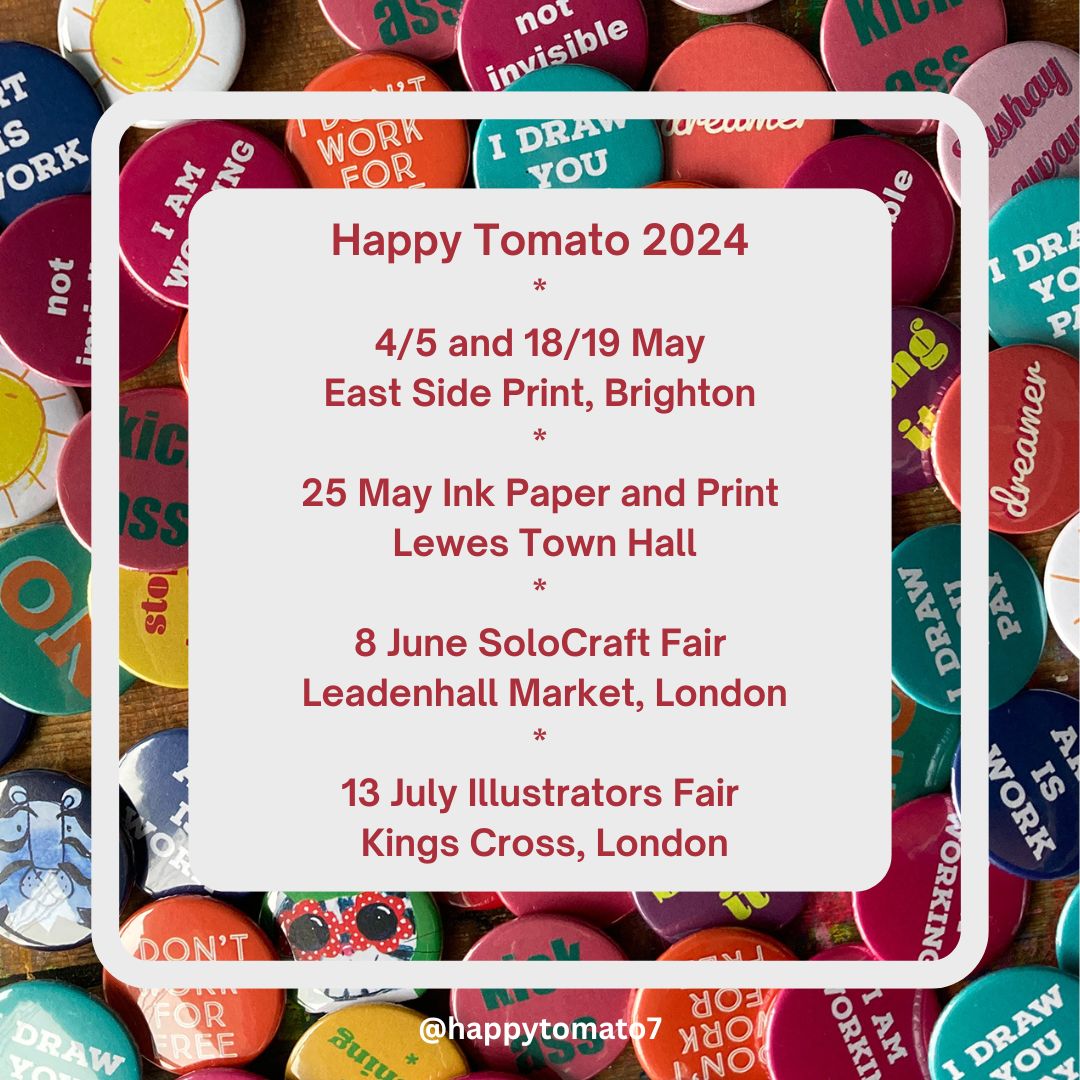
When I sell at fairs and markets I have a broader range of items, one offs and unusual versions of things, including experimental prints. Here are my upcoming events. More dates tbc. The first event is part of Brighton Festival - Artists Open Houses. I will be part of the East Side Print CIC open studio event (it's where I do a lot of my printing) venue 3 on The Kemp town trail- please note it is for two weekends only.4/5 and 18/19 May.11am-5pm. I will be there in person on May 19 pm. On 25 May I will be taking part in the Ink Paper and Print show at Lewes Town Hall. 10.30am -4.30pm. £2 entry, free tickets if booked here 8 June I will be at the SoLo Craft Fair in Leadenhall Market, London. 12-5pm. 13 July I will be at the Illustrators' Fair at Granary Square, Kings Cross London. 11am-5pm Follow me on instagram @happytomato7 for updates and pictures of what I will have for sale. I am working on my next set of printed fabrics, and I am using some 'found' fabrics. In keeping with my Work With What You've Got ethos, I am using some fabrics that were the leftovers from someone else's projects- so not my choices really. Lots of neutrals, and purple! Not my usual choices of colours. It is stretching me a bit to make the colours work together.
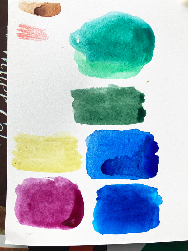
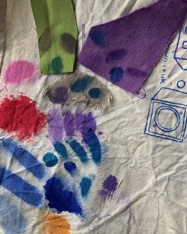
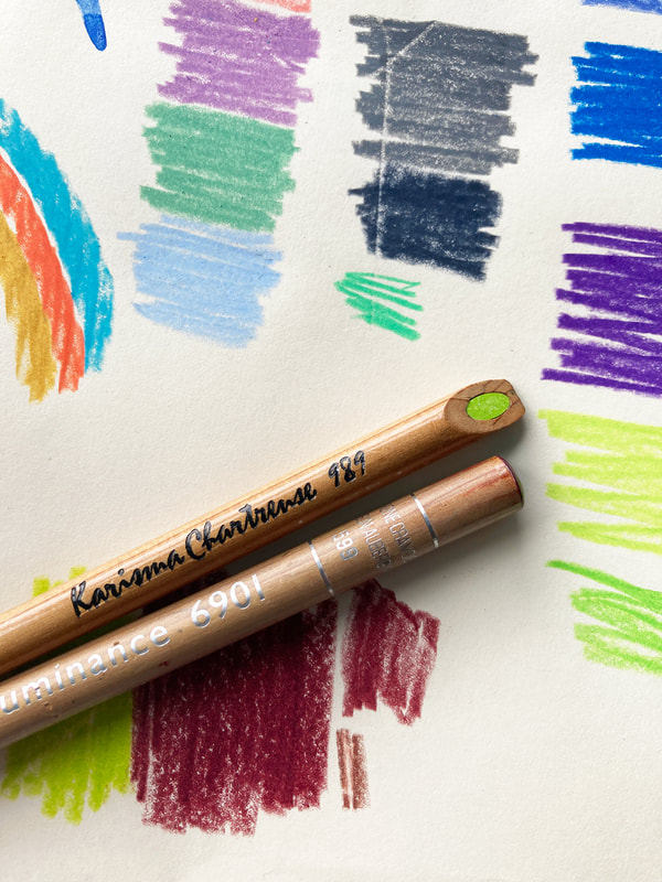
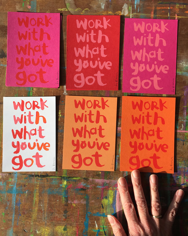
I spent all of yesterday morning mixing colours, out of my comfort zone. Really, I find purple scary. Here are some examples of my experiments mixing dyes yesterday at the wonderful @eastsideprint_brighton smudged onto the backing cloth. I am using transparent mixes of inks, so the base colour really affects the result - the sludgy colours on the green swatch are the same colours as on the purple and cream swatches. (I could use opaque inks but I wanted the pattern to sink in rather than sit on top of the fabric) The bubblegum pink, red and bright blues are from my previous projects - the colours I usually go for Will let you see the results soon. . What's YOUR favourite colour? Now, what colour would you put with it? We all have our favourite colours, but what about colour combinations? The colour you put NEXT to a colour can have a big impact. They could be clashing colours that bounce off each other, very high contrast. Or they could be subtle colours that 'go' together. That sweet spot where everything is harmonious, nothing is jarring, or more prominent than anything else. It seems simple, just pick the colours you like? There are lots of things to consider, including how the colours are going to be used. What looks great on paper, or in theory, could be awful in real life, Can you live with those colours on the wall? Will they make you feel irritable after half an hour? Different colours can affect you psychologically, some lift you, some calm you. Would wearing those colours make you look washed out? And as a design or illustration for fabric or picture book - will those colours from your painted artwork reproduce as you intend them to be, or will they end up as something else in production? Sometimes you have to design with that in mind. My favourite but elusive colour combination. I am really fond of pink and red and orange together, but it can be problematic, because those colours are usually close in tone, with not a lot of contrast. (if the image was switched to black and white, they might be similar greys ) This is a problem when reproducing artwork to print it digitally (for publishing for example. Painted artwork can look very different when it is scanned/photographed.* All the subtle differences between the colours that you can see in real life can be lost when reproducing digitally. So I generally avoid this combination of pink/red/orange in work that is to be developed for printing digitally. But I still love it. In Screen Printing however, I have control over the ink I use, and can experiment with different background colours to print on. This is probably why my range of prints are multicoloured - I want to try all the different combinations. *Pale turquoise blue for instance hardly scans at all. In fact there is a special pencil of this colour that you can use for sketches, so that rough lines won't show in the final scanned piece. (In my illustration work I have developed a palette of gouache colours that I know will scan faithfully - hopefully the finished result will be what I intended, i just have to avoid the beautiful red/pink/orange ) Colour Inspiration
I like to collect colour combinations from real life. Unexpected combinations that I wouldn't necessarily think of. Rows of houses with random colours can produce really good combinations. I have a Pinterest board of colour combinations that I find inspiring, have a look at JoBrownPix Please join Ketchup! for news of the latest product drops in my shop, occasional discounts work in progress, and special exclusive offers.
Gouache paint is a thick watercolour paint, that is opaque. It is great for flat areas of colour - by flat I mean even, no patchiness, completely covering the surface it is on.
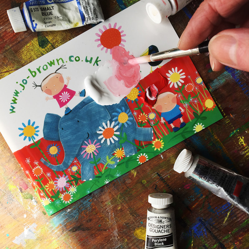
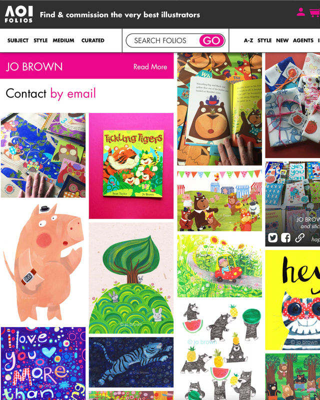
Here are some tips from my years of painting with gouache, that I hope you will find useful. 1.You don't need a fancy paint palette. Squeeze out a little blob of paint onto a shiny surface - a printed postcard, or a plate or a paint palette (plastic or ceramic) wet a brush, a size 6 round brush is good for this, and add a little water to the paint, mix with the brush until it is the consistency of single cream. I just updated my Association of Illustrators page this week. I wanted to tell you how much I appreciate them, and what good work they do for freelance illustrators like me.I've been a member for years. It is tough being a freelance illustrator, and it can be a very isolating experience, especially if you don't work in a shared studio where you would have other artists to talk to about problems.
The AOI support, promote, and protect illustrators in many ways. . They provide help and advice with legal matters, contracts, licences, price negotiations etc. They run provide seminars and write articles on things that relate to illustrators. You can have a portfolio on their site, where commissioners can find you. They run portfolio consultations where you can get advice on the direction you should go in, what elements could be missing from your portfolio, etc. They do a fantastic job at campaigning for illustrators on topics such as copyright The AOI also advertise meet ups for illustrators which take place all over the country. Have a look at the Association of Illustrators here. |
AuthorJo Brown, Illustrator. Archives
July 2024
Categories
All
Want to see which books I recommend?
My affiliate bookshop on bookshop.org is here |

 RSS Feed
