|
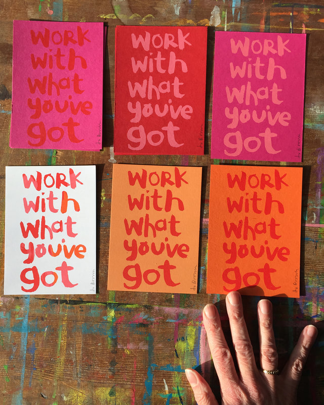
What's YOUR favourite colour? Now, what colour would you put with it? We all have our favourite colours, but what about colour combinations? The colour you put NEXT to a colour can have a big impact. They could be clashing colours that bounce off each other, very high contrast. Or they could be subtle colours that 'go' together. That sweet spot where everything is harmonious, nothing is jarring, or more prominent than anything else. It seems simple, just pick the colours you like? There are lots of things to consider, including how the colours are going to be used. What looks great on paper, or in theory, could be awful in real life, Can you live with those colours on the wall? Will they make you feel irritable after half an hour? Different colours can affect you psychologically, some lift you, some calm you. Would wearing those colours make you look washed out? And as a design or illustration for fabric or picture book - will those colours from your painted artwork reproduce as you intend them to be, or will they end up as something else in production? Sometimes you have to design with that in mind. My favourite but elusive colour combination. I am really fond of pink and red and orange together, but it can be problematic, because those colours are usually close in tone, with not a lot of contrast. (if the image was switched to black and white, they might be similar greys ) This is a problem when reproducing artwork to print it digitally (for publishing for example. Painted artwork can look very different when it is scanned/photographed.* All the subtle differences between the colours that you can see in real life can be lost when reproducing digitally. So I generally avoid this combination of pink/red/orange in work that is to be developed for printing digitally. But I still love it. In Screen Printing however, I have control over the ink I use, and can experiment with different background colours to print on. This is probably why my range of prints are multicoloured - I want to try all the different combinations. *Pale turquoise blue for instance hardly scans at all. In fact there is a special pencil of this colour that you can use for sketches, so that rough lines won't show in the final scanned piece. (In my illustration work I have developed a palette of gouache colours that I know will scan faithfully - hopefully the finished result will be what I intended, i just have to avoid the beautiful red/pink/orange ) Colour Inspiration
I like to collect colour combinations from real life. Unexpected combinations that I wouldn't necessarily think of. Rows of houses with random colours can produce really good combinations. I have a Pinterest board of colour combinations that I find inspiring, have a look at JoBrownPix
0 Comments
Leave a Reply. |
AuthorJo Brown, Illustrator. Archives
February 2024
Categories
All
Want to see which books I recommend?
My affiliate bookshop on bookshop.org is here I buy most of my art materials at jacksonsart .com - affiliate link here, you get 10% off first order.
|


 RSS Feed

