
Jo Brown's news and thoughts. |
Jo Brown's news and thoughts. |
|
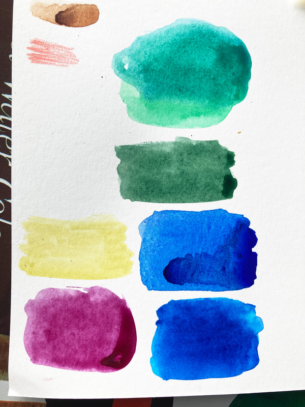
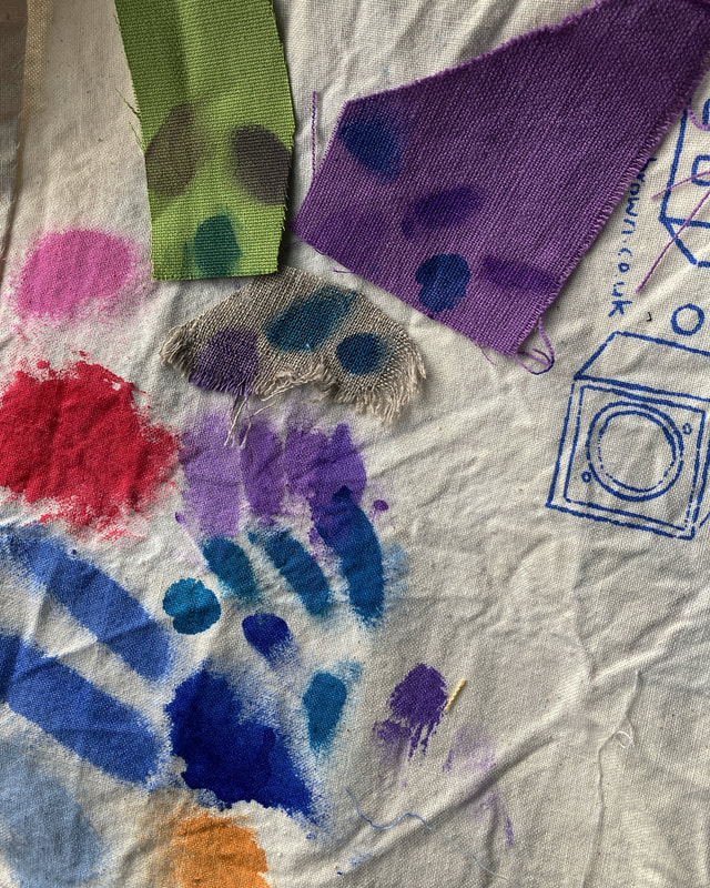
I am working on my next set of printed fabrics, and I am using some 'found' fabrics. In keeping with my Work With What You've Got ethos, I am using some fabrics that were the leftovers from someone else's projects- so not my choices really. Lots of neutrals, and purple! Not my usual choices of colours. It is stretching me a bit to make the colours work together. I spent all of yesterday morning mixing colours, out of my comfort zone. Really, I find purple scary. Here are some examples of my experiments mixing dyes yesterday at the wonderful @eastsideprint_brighton smudged onto the backing cloth. I am using transparent mixes of inks, so the base colour really affects the result - the sludgy colours on the green swatch are the same colours as on the purple and cream swatches. (I could use opaque inks but I wanted the pattern to sink in rather than sit on top of the fabric) The bubblegum pink, red and bright blues are from my previous projects - the colours I usually go for Will let you see the results soon. .
0 Comments
Leave a Reply. |
AuthorJo Brown, Illustrator. Archives
February 2024
Categories
All
Want to see which books I recommend?
My affiliate bookshop on bookshop.org is here I buy most of my art materials at jacksonsart .com - affiliate link here, you get 10% off first order.

|
 RSS Feed
